Wednesday, 12 January 2011

07/12/10 Production for Visual Communications: An Introduction

 "When and how was the first ever Book in Europe printed?"

Gutenberg bible (1445) was the first (real) book to be printed in Europe (more specifically Mainz, Germany), by Johannes Gutenberg. The production of the bible used Gutenberg’s invention of practical movable type. He made metal moulds using dies, into which he could pour hot liquid metal to produce separate letters the same shape as those written by hand. Such letters could be then arranged and rearranged as many times as need be to create different pages from the same letters. Gutenberg then introduced the printing press to press the type against paper. For this he used a hand press. Ink was rolled over the raised surfaces of the handset letters held within a wooden frame, and the frame was then pressed against the paper. This technique enabled sharp impressions on both sides of a sheet of paper and many repetitions. After a page was printed, the type could be reused for printing other pages. His invention of mass printing practices caused the whole industry to change. Previously this European audience had only seen books that were copied out by hand or printed from hand-carved wooden blocks, which greatly affected legibility. Furthermore, wooden blocks were very time consuming and had a short life span, thus causing this to be described as the ‘invention of the millennium.’


"Produce a workflow diagram for your L4 visual work to date based on your RVJs and notes etc."

 A workflow is described as a “Graphical depiction of steps taken, time spent, distance travelled, and other aspects of the way a particular piece of work is done.” They are used to help people understand the process of work and steps needed to be taken within a business. Media used would vary depending on the purpose. One made for a business would need to written on a computer and be legible. One used by myself, to work out what I need to do for a project, is only intended for me to understand, so legible writing for all isn’t so important. The following shows workflow diagram of a recent project that was to produce an eight page zine on “The Underbelly of Birmingham.” It explains visually the work process that took place for this project and the constant interaction between me and my tutor to help push the project further. The books were produced to be sold on at artist fairs, and the project was to teach us about book making.


30/11/10 Text and Image

 “How does text affect meaning of an image?”

Without text, an image could mean almost anything. It isn’t until text is added that the audience can fully understand the image and its context. At a glance it may appear fairly innocent and meaningless but could be the holder of tragedy and grief. Alternatively the image could express ones memory and so on, so be personal to the artist/photographer etc. Thus the meaning is unknown until script/word/sentences are added. Alternatively, images can contain signs that give an indication of the message. For example, the time of day and weather conditions of an image would reflect its mood and perhaps message. Joel Sternfelt produced a series of images taken of murder sites. Text is excluded (and so a script would have been shown alongside the photograph for the audience to read for an explanation), initial thoughts will be naïve. In contrast, Sternfelt has chosen a miserable, perhaps wet day to take this image as an attempt to give clues of its meaning expressing the grief shed over the event and so on. In the end, text is the only way of giving the image its true context.


“How does text effect the emotion of an image?”

Without the use of text, an image can give out certain feelings and emotions through very obvious mechanisms, such as simply photographing a crying woman etc. However, text can cut to the core and emphasize this further or in contrast contradict initial thoughts and explain a photo’s true meaning. Jim Goldberg photographed the homeless, those in poverty and terminal patients, and asked them to write on the image of what happened to them. The stories now become personal. The following image causes the audience to feel empathy for the man. Cues are given like the man being tightly wrapped up in the blanket (somewhat resembling an Egyptian Mummy), restricted of movement and perhaps being treated as if he is dead already. However, the text that he provides changes your view as he explains that now his life has become easier, giving a sense of relief to the audience and puts the image into context.
            Jenny Holzer produced work by plastering messages across giant advertising hoarding in Times Square, New York. Her messages are challenging and present contradictory opinions, in the hope of sharpening people’s awareness arising different emotions towards the ‘usual baloney that are fed’ in daily life, highlighting issues in dramatic ways. Without the text the image doesn’t mean anything, but these backgrounds are just used purely for dramatic purposes. She uses billboards, LED signs and so on, blazing phrases in places they wouldn’t be expected to be seen, provoking emotion and thought.


23/11/10 Development of Creative Thought and Structure in Illustration and Graphic Art

“Developing Ideational Fluency”

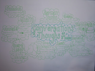
“Ideational fluency can be defined as easily produced ideas that fulfill certain requirements.” To achieve this, tools such as Classification, Brainstorming and Mind Mapping are used. It refers to the quantity and diversity, but not necessarily the quality of ideas. When given a brief, visual communicators need to immediately start generating different ideas and directions for the project. As stated before this method is more greatly concerned with quantity, as analyzing and evaluating the ideas after
experimentation and discussion will then increase the idea’s quality. Classification allows recognition of common denominators and making connections between ideas. Brainstorming helps develop spontaneous thinking and generate more ideas, and Mind Mapping organizes thought process and encourages associations between these thoughts. The organization of thoughts is important, as connection between ideas become more apparent, and it is these connections that can lead to the development of higher quality ideas. Creative people usually think/work better visually, and so these method cause physical/visual connections between the thoughts to be made. Ideational Fluency is likely to not make much sense to others and is only really for the one who wrote it, to organize their thoughts. Here are some examples of my own Ideational Fluency, both visual representations of initial ideas and thoughts to kick-start my projects. Some ideas link to others to reflect their common denominators. Using a range of colors is particularly useful so connections can be highlighted visually and understanding the ideas perhaps made easier. From these I then was able to make connections and recognize stronger ideas, experiment and develop them further. A key aspect of generating ideas could also be discussion. Thoughts maybe interpreted differently and so generating further connections and ideas.  


“Managing a Creative Environment”

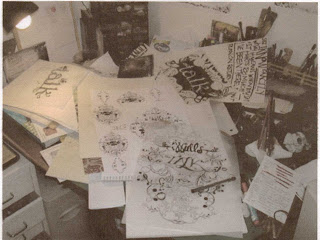
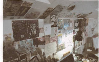
Sarah Coleman is a Freelance Illustrator and Calligrapher who has produced work for books, as well as sport companies and so on. Her studio space walls are plastered with her work and the work of those who inspire her; the desks are filled with sheets of paper, brushes, crayons, inks, paints and even the occasional potato for printing. Work appears to take place all over the room, including the floor, and she has many storage compartments for materials and things she has collected to fuel her inspiration. For illustrator such as herself it’s hard to find time off so she has to make use of things around her for new ideas, which could include watching a movie or reading a book. These sources are only for the benefit of that one illustrator, different people will be inspired by different things and thus collect different type of inspiration. One’s studio will reflect one’s own interests and their way of working. Information gathered needs to be relevant to and be in context with what an illustrator is working on and the work produced will reflect the illustrators own interpretation of the brief and inspiration. I try to create an innovative environment to work in. I usual find myself working everywhere within the space, making use of each area possible, moving to different places when I start new things and want to start a fresh with a change of scenery. I like to use a wide range of media and am a hoarder, covering my wall with postcards, images and even clothes tags. A lot of things inspire me; I often spend time searching through my grandmother’s collections of buttons, stamps and so on, to find new inspiration, such as patterns found on an old coin.


Wednesday, 17 November 2010

Production and Outcome 09/11/10

 “Interpretation”
“How do Illustrators amplify the ‘meaning’ within a message?”

When deconstructing artwork, we find that time is very relevant in how we view it. The same illustration released at different points in history, changes the context of the image and thus produces different reactions, because of what the audiences are used to. Walt Disney came up with the idea for Snow White and the Severn Dwarfs when he was only 15, and was the first ever animated featured film. The most current illustration was released in the late 21st Century.  To understand the meaning, time needs to be considered. This era is a highly computer-based culture. The illustration of Snow White has a high digital quality, creating a three-dimensional feel to the cartoons, and as much as possible making the characters look realistic. The image has been retouched and digitally enhanced using programs such as Photoshop. It is based around the original but as technology grows our culture becomes more and more concerned with realism.  Further, Snow White, aimed at a young audience, is portrayed as an innocent, beautiful girl, clear pearly white skin, rich black hair, big brown eyes and scarlet lips, a ‘typical’ beautiful girl. Alternatively, Paula Rego’s illustration, ‘Swallows the Poison Apple,’ (1995) revises the tale of Snow White. Aimed at an older audience as she has striped away at this seemingly innocent tale, revealing a more sinister side. The Princess is depicted as a middle-aged woman dressed in the traditional Snow White costume. Working with pastilles, Rego uses strong colours, reflecting the mood of the piece. She uses red to represent the blood, appearing as if it’s pouring out of her, emphasizing her last few moments of life. The piece stresses the pain of the poison eating away at her as she twists and turns within the room. The image was create soon after the film had been first been release on video, and so it was popular at the time. This rather different take on the story using sinister illustrations reflects her inspiration of her father’s book ‘Dante’s Inferno.’ Further, Rego has been strongly influenced by her Portuguese background, which was obsessed with story telling.


"Delivery"

"Choose one creative and show how the format (and platform) has been used to great effect..." 

The context and how ideas are delivered are equally as important as the image itself. Delivery alters how the image is read and must reflect the message that is being communicated. Importantly, platforms need to be used in interesting ways in order to be effective.  Julie Verhoeven is a fashion designer, illustrator and artist, as well as a part time tutor. She has produced two books of her work, “Bottomed Girls” and “Gas book.” The medium of a book is an informative way of illustrating your work. Sizes of the images are restricted to a fairly small scale. However, here the images are for the purpose of informing and communicating visually, accompanied by text for understanding. Text is used for explanation of the work and artist herself, communicating her influences, successes and career. A book attracts a smaller audience billboards or posters, as books are bought after having prior knowledge of the illustrator that is received through these other methods.  If images were taken directly from this book in order to advertise Verhoeven’s work, they would be taken out of context and this format of the images wouldn’t be appropriate. Changes in size of the images is effective in drawing attention to perhaps more successful work or those that have interesting stories behind them. The front cover of “Gas Book” is colourful and abstract, which immediately catches ones eye. It is an effective image to use, as it is what the audience forms they’re first impressions based upon, and is a crucial decider of whether to look inside or not. This format, similar to an artist’s sketchbook, could be described as the illustrator’s visual journey of her life, work, and career.

Development of Ideas and Structure in Moving Image 02/11/10

Story Development:
‘Story Development: Three-Act Structure.’

TASK:
‘Identify 3 Act Structure in a recent film.’

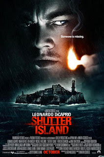
“Every movie needs to have a beginning, a middle and an end, but not necessarily in that order” (Jean-Luc Godard). Films have a 3 Act Structure, which can be played around with. In more complex films the structure can be non linear e.g. Pulp Fiction. Shutter Island is a psychological thriller intended for the older (15+) audience. The film is a mystery that unravels as it goes on, leaving the ending ambiguous for your own interpretation. The meaning expresses what mental illnesses are truly like. Even though we can’t be sure that Teddy is in fact ‘insane’ he experiences the feelings of someone with a mental illness. The message is understood through the other characters, such as the real ‘Rachel.’ She states, when declared as insane, anything you say against it just proves their statement. It is a very lonely state of mind. Act I: U.S Marshall Edward ‘Teddy’ Daniels travels with his new partner, Chuck, to Shutter Island, a Mental Institution for the Criminally Insane, to find a missing patient. The truth is hard to come by and Teddy is told by a patient to ‘RUN,’ but he aims to find Andrew Laeddis, a man who caused a fire that killed his Wife. He suspects they are conducting experiments on the patients’ minds. Teddy dreams about a mysterious girl and his Wife who tells him Laeddis is on the Island. The missing patient is found and returned back to the institute. As the opportunity arises Teddy and Chuck enter Ward C to uncover Shutter Island’s secrets. Act II: Teddy finds George Noyce, who reveals the experiments that go on. Noyce blames Teddy for everything and tells him he can trust no one. Teddy tries to get to the lighthouse but looses Chuck. He then finds the real missing patient hiding in a cave in the cliff. She reveals that they experiment on patients to create ‘ghosts,’ men with no feelings, and now Teddy is trapped here. When Teddy asks the Doctor about his partner he says he came alone. Act III: Teddy makes his way to the lighthouse, his hallucinations getting worse. When inside he only finds the Doctor sitting at a desk. The doctor tells Teddy that he is Laeddis, he killed his wife because she drowned his children and he invented this persona because he couldn’t live with the truth. Chuck is his primary psychiatrist, he has been a patient for 24 months; they let him play out this life in hope he would admit reality, otherwise permanent measures will be taken. Finally Teddy accepts their ‘truth.’ He then talks to Chuck about uncovering the secrets of Shutter Island. Chuck signals to the doctor that he has relapsed. And he is lead to the lighthouse just after saying, “which is worse, to live as a monster or die as a good man?”


Pre Production: Character Design

TASK:
‘Select a Character from TV or Film and produce an illustrated guide, including the 3 Key Areas.’

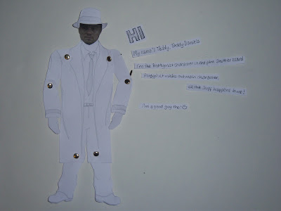
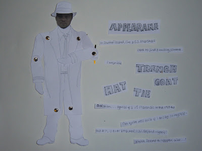
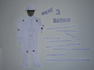
Edward ‘Teddy’ Daniels is the Protagonist character of the film “Shutter Island” (2010). Martin Scorsese directed the film, aimed at age 15+ audiences, containing violence and is a psychological thriller. A Protagonist is the main character in a story and is the one to experience the conflict. There are three important aspects of a character that build up the character’s profile, appearance, action and interaction. In contrast, the protagonist does not have to be “good.” Using special effects to create the notion of hallucinations, flashbacks and dreams reveals a lot of, at first, confusing information but continues so to better understand the film. Daniels experiences all aspects of the film; the message is expressed through him. He illustrates the point of view the mentally ill. However, we don’t know if Teddy is actually ill. But even if he isn’t, the people around him all cause him to feel how one would who suffers a mental disorder. He feels isolated, confused, irritable, and unsure whom to trust. We experience everything through his eyes, receive conflicting information and relate to how he is feeling, as we are tricked ourselves. The film is set in 1954, a time where mental illnesses weren’t widely understood and some thought that ‘fiddling’ with the brain could cure it. All aspects of the film builds up an understanding of what it could possibly be like living in this time with a mental disorder. I produced a stop motion animation as an illustrative guide, but the video has been distorted and blurred during conversion, so I also uploaded screen shots of the important photographs from the animation.


Wednesday, 27 October 2010

Visual Reflective Journal 26/10/10

 ‘Draw. Work by Hand.’

 Visual people think and work visually and the key is drawing. To express ideas they contain development work to sketchbooks. Drawing is about exploring, playing and thinking out loud. A wide a range of media should be experimented with, in order to challenging yourself and create new ideas. Visual Communicators express themes, ideas and development through drawing. Each image doesn’t need to be a work of art; they are just a way of illustrating your thoughts in visual form. Jill Calder takes a sketchbook wherever she goes, drawing everything that inspires her and that could develop her current ideas and project further. Here are some images of her sketchbook work. They are everyday scenes of what she has seen and become a narrative and a journey of her ideas. They are playful but also document the information she needs. The only critic of your development work is yourself, whom you need to manage in order to be able to play and explore to get your ideas out there, on the page, without the feeling that your work isn’t good enough. However, the work can’t be completely random, it is for a purpose, a concept or brief, so evaluating the work, and listening to this ‘critic’ (but only after the playful stage) is necessary to stay on track. Drawing is not limiting and can be created by cutouts, (e.g. Marion Deuchars and Peter Callesen), stitch (e.g. Lizzie Finn) sticking down, biro, paint and so on.


‘Cyclic Design Process.’

The Cyclic Design Process is all about iteration. You think, you plan, you do, you evaluate. Then the cycle starts again. Creative people have worked in this way for many years. It is to do with the fact that you don’t stop until you get it right. There is nothing worse that settling with something that is adequate, as in a creative profession you are always competing with others. You need to continuously interrogate your work. Can it look better? Can it be better? Thomas Edison designed over 10,000 prototypes before inventing the light bulb. An important principle is you learn by doing, and this is how the cycle comes in. This structure enables you to play first, but then step back and evaluate the outcome. Pablo Picasso produced more than 60 portraits of his lover Fernande Olivier, between the spring and fall of 1909. He used a variety of media and formats, and through his devotion to one subject the series has been described as ‘unprecedented in the history of portraiture.’ Portrait of Fernande, Horta de Ebro, summer 1909, (oil on canvas) explores cubism and expresses Picasso’s ‘radical reformulation of human physiognomy’. Other media includes watercolours in ‘Standing female nude,’ fall 1909, and black chalk for ‘Study of head of woman (Fernande)’ 1909. Some of the images are unfinished as
 Picasso has allowed himself to play freely, but through evaluation has moved on to others. A valuable quote by Picasso states ‘I never ‘finish’ a piece of work…I merely abandon it.’

Monday, 25 October 2010

Five Ideas (Principles) 12/10/10


Week 3      12/10/10
'Find examples of visual communications that shows Visual Hierarchy (or lack of hierarchy) and explain why.'

Visual Hierarchy is about what the audience sees/reads first and then the order your eyes follow afterwards. There are things that can affect visual hierarchy such as colour, weight, images and typography. These are all devices that designers use to attract their potential audiences, which, here, would mainly be women, aged 17-26. The order may vary for some but will essentially be similar. Magazine covers are good examples of visual hierarchy. This example of Vogue’s October Edition would be aimed at people who had a high interest in fashion. The designers start with an image of one of the biggest names in fashion, Kate Moss, on the front cover. Her face becomes the focal point. All the text is the same colour because the designer wants the image, and most importantly what she is wearing to be seen first. The title is next to catch the audience’s eye. It's the largest type and holds the most weight. It’s bold, and is spre ad across Kate Moss's forehead, so your eyes are drawn in. Then your eyes are drawn down the page, towards the side headings, perhaps to the left side first to the bold type, or towards the bottom where the designer has used the second biggest font and also changed the type-face to something very different. This would probably be because it is an important feature to this edition. Smaller, lighter text is read last. This is used often just to offer descriptions to larger headings. Different topics are grouped. More dense groups will be seen first, but overall the structure of the writing frames the face. A sophisticated, elegant font type is used to reflect the message the magazine needs to express, as Vogue is all about fashion and thus trend setting, and need to maintain this image. The visual hierarchy here has been used well and reflects the magazine accordingly.

  
'Find examples of visual communications that are legible or illegible and explain why.'
What makes visual communications legible?

The type-face (not using all capitals for long sentences) layout, type size, colour (no yellow on white), and so on. This image is an anti-smoking advertisement. It's simplistic, but displays the right message. The text is limited, and so allows the audience to interpret the message alone. Immediately you see the burning cigarettes in the mouth. The lips are perfectly shaped, evenly applied with lipstick; the mouth alone expresses a 'sexy' image and a connection with kissing is made. It is aimed at a young smoking audience, playing with the idea that smoking isn't at all sexy. This audience doesn’t want to be bombarded with information on the dangers of smoking; they’ve heard it all before, so the advert is good at relating to them. The only text available is the web address, and once again the idea of kissing is suggest. As the smoke is rising within the mouth, you can almost taste it, the mouth doesn’t seem that appealing anymore.  It is legible and uses the idea that a 'picture can be worth a thousand words.'